Configuring a Dashboard Item
This topic demonstrates some of the basic steps for configuring a dashboard item (bar chart, pie chart, gauges, etc.) in the Dashboard Layout Designer. The simple bar chart in this example is based on block-level simulation results from a reliability block diagram in BlockSim. The data source options will be different for other locations where dashboards are available, see Project Planner, Analysis Explorer, Simulation Diagram Dashboards (BlockSim), FMEA Dashboards (XFMEA/RCM++) or RDW Dashboards (Weibull++).
In a secure database, only users with the "Manage dashboard layouts" permissions can create layouts.
Add the Chart
Add a chart to the Layout panel by choosing Home > Insert > Chart.
![]()
Define the Chart Data
- Select a data source from the drop-down list in the Data Source panel, if applicable.

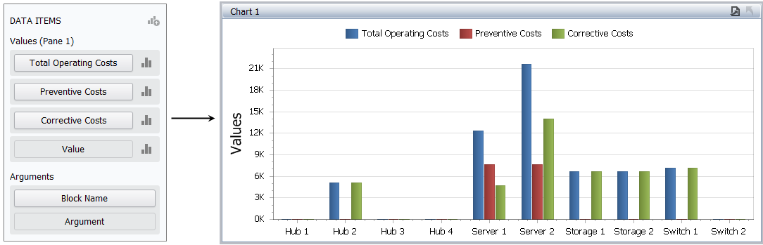
- Choose the data field (or fields) that will be displayed in the y-axis of the bar chart, then drag each field into the Values area in the DATA ITEMS panel. For this example, the chart will display total operating cost, cost from preventive maintenance and cost from corrective maintenance.
Note that when different data sources are available, all of the data fields used within a chart must come from the same source.
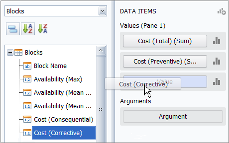
Tip: To replace a data item, drag a new field on top of the current one. To remove a field, drag it anywhere outside of the data item; and to completely clear the DATA ITEMS panel, right-click the chart and select Remove Data Items.
- Use the drop-down list to see which values are available for this data field (e.g., count, sum, average, etc.) and choose one to display in the chart. Note that the same option must be selected for all values in the same chart.
Because we want the total cost from all blocks that meet the given criteria, we use the default Sum for this example.
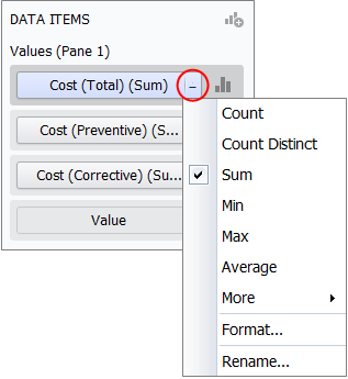
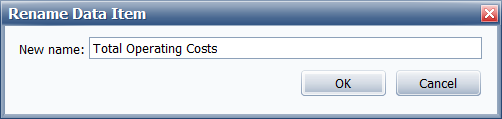
- If appropriate, use the Rename command to change the name that will be displayed in the chart legend, tooltip, etc.
- Choose the data field that will be displayed in the x-axis, then drag it to the Argument bar.
Filter the Data
To filter the data displayed in the chart, choose Data > Filtering > Edit Filter.
![]()
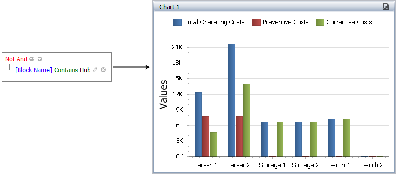
Use the Filter Editor to define the criteria. For this example, we’re using the "Not And" operator to exclude any blocks with a name that contains "Hub."
Tip: You can use hidden data items to filter based on fields that are not displayed in the chart.
Sort by “Top N”
To configure the chart to show only the top 5, bottom 10, etc., use the Top N command in the Argument data item’s drop-down list.
For this example, we’re showing only the Top 5 blocks, based on total operating cost. The results are displayed from highest to lowest and the order cannot be changed.

Tip: Alternatively, you could use the Sort by command to sort by the argument data item — which is labeled (Value) in this menu — or by any of the value data items. Click the Argument bar to toggle the sort between ascending and descending order.
Other Design Options
Click the Design tab on the ribbon to access other configurable options for this type of chart. For example:
- To hide or display the caption bar above the chart, choose Show Caption.
![]()
We will keep it displayed for this example.
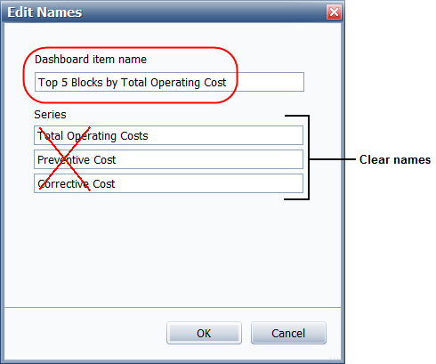
- To change the title in the caption bar to something more meaningful, choose Edit Names.
![]()
For this example, we will set the Dashboard item name to “Top 5 Blocks by Total Operating Cost” and clear all of the Series fields to make sure the latest data item name (set via the Rename command in the data item’s drop-down list) will always be used in the chart legend and tooltip.
- To change the y-axis title to a more meaningful name, choose Y-Axis Settings.
![]()
