Project Planner Dashboards
You can use the flexible Dashboard utility for presenting data from any Project Planner in the database.
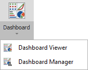
To access this feature, open the planner and choose Project Planner > Tools > Dashboard.
As with any other dashboard, you can use the Dashboard Viewer to select any of the layouts that have been predefined for this type of data. In a secure database, only users with the "Manage dashboard layouts" permission can use the Dashboard Manager to create or edit layouts.
Data Source Drop-Down List
When you are creating a dashboard layout based on project plan data, the drop-down list at the top of the Data Source Panel gives the following options:
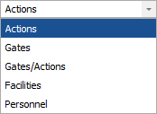
- Actions returns data only from actions in the current plan.
- Gates returns data only from gates in the current plan.
- Gates/Actions returns data from both actions and gates.
- Facilities returns data from the facilities assigned to actions.
- Personnel returns data from the person responsible and/or team assigned to actions.
Each data source allows you to choose relevant fields from the record properties, summary panel and/or project plan hierarchy.
Note that all of the data fields used within a particular dashboard item must come from the same source. For example, you can’t combine fields from the “Actions” data source and the "Gates" data source in the same chart. If you want to create a chart that includes both actions and gates, use the fields from the "Gates/Actions" data source instead.
Examples for Different Field Types
The icon for each field indicates the data type:  text,
text,  number or
  date. There are many
possible ways to use these fields in your own customized dashboard
layouts. The following simple examples demonstrate basic applications
for each data type.
date. There are many
possible ways to use these fields in your own customized dashboard
layouts. The following simple examples demonstrate basic applications
for each data type.
Example Using Counts
This pie chart uses the Count value for a text field to show the actions in the current project plan broken down by status. The argument determines the slices shown in the pie.
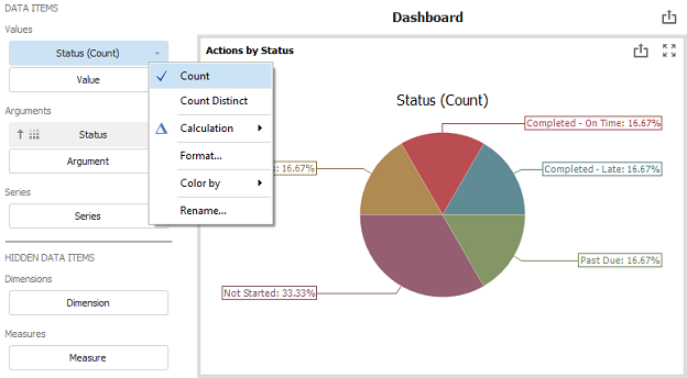
Tip: If you want to see both the quantity and the percentage, choose Design > Data Labels > Argument, Value And Percent.
Example Using Numbers
This bar chart uses the Sum values for two number fields to show the top 5 most costly actions in the current project plan, with comparison to the planned cost. The arguments determine how the bars are labeled, grouped and sorted.

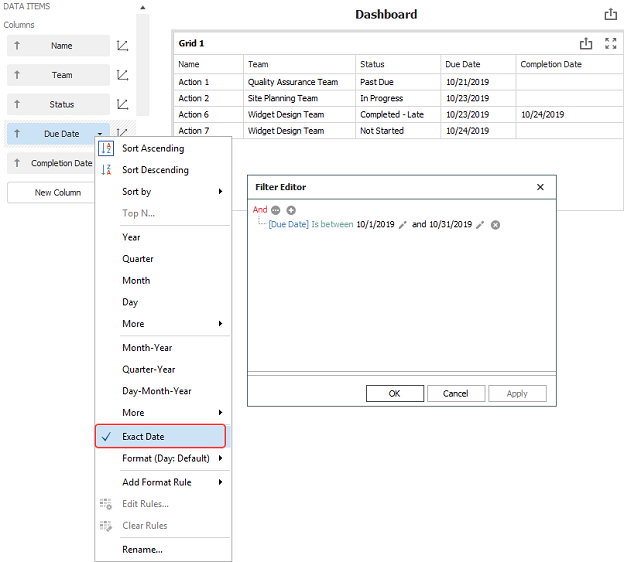
Example Using Dates
This grid uses the Exact Date for two date fields to show a list of all actions in the current plan that are due in the current month. (To set the criteria that filters the records shown in the grid, right-click inside the chart and choose Edit Filter.)