Analysis Explorer Dashboards
You can use the flexible Dashboard utility for presenting data from the Analysis Explorer.
As with any other dashboard, you can use the Dashboard Viewer to select any of the layouts that have been predefined for this type of data, and you can use the Dashboard Layout Manager to create or edit layouts.
(In a secure database, the Dashboard Layout Manager is available only for users with the "Manage dashboard layouts" permission.)
Values and Arguments
When you’re creating bar charts or pie charts based on Analysis Explorer data, note that the argument(s) determine the bars or slices shown in the chart and the value will always be the quantity of analyses that fit the specified criteria.
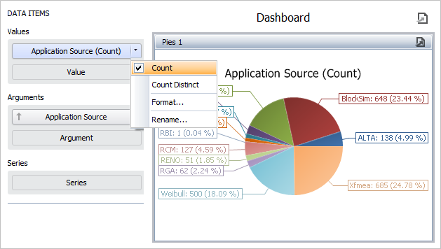
If you use the default Count option when specifying the value, then any of the Analysis Explorer properties will return the same quantities. You may prefer to choose the one that gives the most appropriate chart label(s). For example, the following pie chart uses the same property (“Application Source”) for both the Value and Argument in order to display the total quantity/percentage of analyses for each ReliaSoft application.
Tip: Use the Design tab of the ribbon to configure the chart labels and other settings to fit your particular preferences. For example, in this chart, the Data Labels are configured to display the Argument, Value and Percent (e.g., BlockSim: 648 (23.44%).
If there is ever a situation in which you want to show only the number of distinct values for a particular property, you can use the Count Distinct option instead. For example, the following pie chart uses User Created By (Count Distinct) for the value in order to show the number of users who created analyses with each ReliaSoft application.
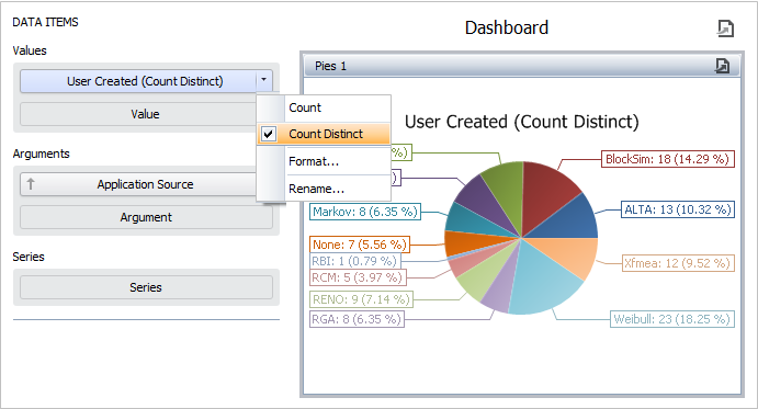
As you can see from looking at both charts, the "Count" shows that there are 648 total BlockSim analyses; while "Count Distinct" shows that only 18 distinct users created BlockSim analyses.
Filtering the Data
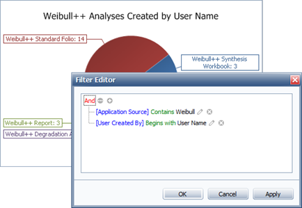
Any filters that are currently applied in the Analysis Explorer grid will not be reflected in the dashboard charts. However, you can incorporate filters directly into the dashboard layout. For example, if you want to show all of the Weibull++ analyses that were created by a particular user, you can create a filter like the one shown next. (See Using the Filter Editor.)
In addition (or instead), you can configure the layout with one or more master filters that allow individual users to change the filters on-the-fly in the Dashboard Viewer. (See Configuring a Master Filter and Using Master Filters.)