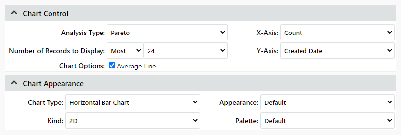
Chart Control and Appearance
Chart Control
When you are building a chart, the following settings on the Report Builder page specify how the data will be presented.
- Analysis Type - you can select Pareto (e.g., bar chart, pie chart, scatter chart, etc.) or Trend Analysis (e.g. line chart).
- X-Axis and Y-Axis specify the data displayed in the chart. This is always a count of the number of records that have the same value for the field selected as the Y-axis (e.g., incidents by responsible part, actions by type, etc.).
Tip:
The Y-Axis list excludes some types of fields that
are not relevant for this type of chart (e.g., descriptions, check
boxes, accessories, companies, trees, part details, etc.).
In addition, it is not recommended to select fields that show counts
obtained from the query (e.g., Action Count, Status Count, Chargeable
Incident Count, etc.). In such cases, the chart will show a separate
bar or slice for each record and increment any duplicate counts
(e.g., 2, 2 [1], 2[2], etc.).
- Number of Records to Display
- For pareto analyses, you can display the records that either have the most number of matches to the criteria or the least number of matches to the criteria.
- For trend analyses, you can display the records that either have the most recent dates that match the criteria or the oldest dates that match the criteria.
- Chart Options
- For pareto analyses, you can show the Average Line.
- For trend analyses, you can show the Average Line or the Trend Line. The Trend Line shows a smoothed-out curve that follows the data. This an Exponentially Weighted Moving Average (EWMA) line, which is calculated using a cubic B-spline (CBS) process to smooth out the line, with a correction factor of 0.5.
Chart Appearance
These settings are applied when the chart is first generated and can be changed later.
- Chart Type - for Pareto analysis, select bar, line, area, step, pie or scatter. Trend charts can only display as a line chart.
- Kind - 2-dimensional or 3-dimensional
- Appearance - the background color scheme
- Palette - the colors used for chart elements
In the following example, these settings will generate a horizontal bar chart that shows the 20 dates on which the greatest number of incidents were created along with a line showing the average number of incidents created daily.
