QCP Calculations and Plots for Crow Extended
For reliability growth data analysis only.
Weibull++ includes a Quick Calculation Pad (QCP) for computing useful metrics, as well as multiple plots that allow you to visualize the results of your analyses. This topic describes the calculations and plots you can obtain from data sheets analyzed with the Crow Extended model.
Note: When you analyze data from multiple systems, Weibull++ combines the data to create a single representative system (i.e., equivalent system, superposition system or cumulative timeline, depending on the data type). Any plots generated for the combined data set and subsequent analyses via the Quick Calculation Pad will be based on the resulting representative system. See Times-to-Failure Data from Multiple Systems and Fielded Data for more information about how the software combines the data for analysis.
QCP Calculations
You can open the Quick Calculation Pad (QCP) by choosing Growth Data > Analysis > Quick Calculation Pad or by clicking the icon on the control panel.
![]()
To perform a calculation, select the appropriate option and enter any required inputs in the Input area, then click Calculate. For more detailed information about all the options available in the QCP, see Quick Calculation Pad (QCP).
The Basic Calculations tab of the QCP includes the typical calculations for traditional reliability growth analysis (e.g., cumulative/instantaneous MTBF and expected number of failures). These calculations are applicable only when your data set includes BC failure modes. (See QCP Calculations and Plots for Traditional RGA.)
On the Extended Calculations tab, the available calculations will vary depending on whether you’re analyzing failure times or mixed (discrete) data. For failure times, the calculated values will be mean time between failures (MTBF) and failure intensity (FI). For mixed data, the values will be reliability and probability of failure. Most of these calculations are applicable only when your data set includes BD failure modes.
- Three values can be calculated for either the mean time
between failures (MTBF), failure intensity (FI).
- The Demonstrated/Achieved values reflect the reliability at the end of the observation period, before any delayed fixes have been implemented.
- The Projected values reflect the reliability that will be achieved after the delayed fixes have been implemented.
- The Growth Potential values are the best values that could be achieved by applying the current reliability growth management strategy. In other words, this estimates the maximum reliability growth that you can expect if you continue to find new failure modes at the same rate and make the same types of decisions about which failure modes to fix.
-
Discovery Rate is the rate at which new BD failure modes are being discovered (i.e., the failure intensity of unseen BD modes) at a specified time. For example, if the discovery rate at 400 hours is 0.02, then 0.02 new BD modes are being discovered every hour (equivalently, 2 new BD modes are discovered every 100 hours).
-
MTBF BD Unseen is the mean time between failures due to unseen failure modes at a specified time (i.e., BD modes that did not appear during the observation period but are estimated from the analysis).
-
Number of Failures is the cumulative number of failures that are expected to occur by a specified time, based on the fitted model.
- If the data set includes BC failure modes, then this value is calculated on the assumption that the reliability changed during the observation period. The option will thus be on the Basic Calculation tab with the other typical calculations for traditional reliability growth analysis (e.g., cumulative/instantaneous MTBF).
- Otherwise, the calculation assumes that the reliability neither deteriorated nor improved during the observation period (i.e., beta = 1).
-
Expected Fleet Failures is the number of failures that are expected to occur for all systems by a specified time. This option is available only for fielded repairable data and for fielded fleet data.
Plots
You can create plots by choosing Growth Data > Analysis > Plot or by clicking the icon on the control panel.
![]()
This section describes the types of plots you can create for the Crow Extended model. The scaling, setup, exporting and confidence bounds settings are similar to the options available for all other reliability growth analysis plot sheets. (See Plots.)
Once again, the available calculations will vary depending on whether you’re analyzing failure times or mixed (discrete) data. For failure times, the calculated values will be mean time between failures (MTBF) and failure intensity (FI). For mixed data, the values will be reliability and probability of failure.
The plots described next apply to data sets that include at least some BD modes. Some of these plots apply specifically to data sets that consist entirely of A/BD modes (e.g., when you use the Crow Extended model to analyze fielded data), where the analysis assumes that there is no reliability growth during the observation.
- Cumulative Number of
Failures shows the total number of failures versus
time. Data points on the plot represent the cumulative number
of failures that have been reported by a given time (e.g.,
the second point marks the time at which the second failure
was observed). The lines that can be included will vary depending
on whether there are BC modes in the data set.
- If both BC and BD modes are included, the plot can include the Expected Failures line, which serves as an empirical goodness-of-fit test for the Crow Extended model. It is fitted using the beta that was calculated from the data points.
- If only A/BD modes are included, the plot can include the Assumed Parameters line based on the assumption that beta = 1 (i.e., no reliability growth was experienced during the observation period) and the Estimated Parameters line based on the beta calculated from the data points. You can then compare the two lines to evaluate whether the beta = 1 assumption is valid.
- The [Value] vs. Time plots show how the value increases, decreases or remains constant over time. The points represent the actual failure times in the data set and the plot includes one line for the instantaneous value and one line for the cumulative value. These plots are available when your data set includes BC failure modes.
- Beta Bounds
is available when only A/BD modes are included in the data
set. This plot is used to assess the validity of the assumption
that beta = 1. For example, if the two-sided 95% confidence
bounds on beta do not include 1, then you can (with 95% confidence)
reject the hypothesis that beta = 1. The following lines can
be shown in the plot:
- The Beta Hypothesis line marks beta = 1.
- The Beta Bounds lines show the confidence bounds for beta at five different confidence levels. You can configure these lines using the Beta Bounds window.
- System Operation
is available only for multiple systems analysis. It shows
the failure times of each system in the data set, along with
the timeline for their representative system (i.e., equivalent
system, superposition system or cumulative timeline), which
is used to evaluate all the failures and fixes that occurred
during the observation period. Each type
of event is color coded on the plot: failure (red circle),
implemented fix (yellow triangle), performance failure (blue
circle) and quality failure (green diamond).
To learn more about how the failure times are combined, see the following topics:- For multiple systems times-to-failure data types, see Times-to-Failure Data from Multiple Systems.
- For fielded data types, see Fielded Data.
- The Growth Potential plots are applicable only when the data set includes BD failure modes. The plots can include these items:
-
The Demonstrated/Achieved point represents the value at the end of the test, before any delayed fixes have been implemented.
-
The Projected point represents the expected value after the delayed fixes have been implemented.
-
The Growth Potential line represents the best value that could be achieved by applying the current reliability growth management strategy (i.e., the portion of the system's failure intensity that will be addressed by design fixes).
-
If desired, you can use the Show/Hide Plot Items window to show the Instantaneous line, which shows how the value changes over time during the test. The instantaneous value is calculated over a small interval dt that begins at a given time. For example, an instantaneous MTBF of 5 hours at 100 hours duration means that, over the next small interval dt that begins at 100 hours, the average MTBF will be 5 hours.
-
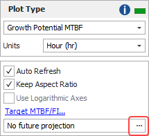
If desired, you can estimate the projected MTBF or failure intensity with a specified amount of further testing. This option is applicable only for developmental testing when BD failure modes are included in the data. To enable this option and specify a time greater than the termination time, click the [...] button.
-
The Final bar charts provide the same information as the Growth Potential plots, but using bars instead of lines.
-
Cumulative Number of BD Modes shows the total number of unique observed BD modes versus time. This plot can include these items:
-
Data points on the plot represent the cumulative number of BD modes that have been discovered by a given time. For example, the second point marks the time at which the second unique BD mode (e.g., BD2) was observed.
-
The Cumulative Number of BD Modes line is fitted to the data points and shows how the cumulative number of discovered BD modes changes with time.
-
-
MTBF BD Unseen and Discovery Rate show the rate at which new unique BD failure modes are being discovered at any given time. For example, if the MTBF for unseen BD modes is 50 hours, then 2 more unique BD modes are expected to be observed over the next 100 hours. The discovery rate is the failure intensity of the unseen BD modes (i.e., the inverse of the MTBF). In a successful reliability growth test, the MTBF for unseen BD modes will increase over time and the discovery rate will decrease.
-
The Individual Mode bar charts show two bars for each failure mode. Use the Plot Modes window to choose which failure modes to include in the chart.
-
The Before bars represents the value at the end of the test, before any delayed fixes have been implemented.
-
The After bars are available only for BD modes and represents the value after the delayed fixes have been implemented.
-
-
The Failure Mode Strategy pie chart breaks down the overall failure intensity (FI) into six possible categories:
-
The Type A slice represents the FI that is due to failure modes that are ignored (i.e., no fixes will be implemented).
-
The Type BC - Seen slice represents the FI that is due to BC modes that were observed and for which fixes were implemented.
-
The Type BC - Unseen and Type BD - Unseen slices represents the FI that is due to BC and BD modes that were not observed but are estimated from the analysis. If they were observed (e.g., through future testing), fixes would be implemented.
-
The Type BD - Remained and Type BD - Removed slices represent the FI that is due to BD modes that were observed (i.e., they represent the FI due to seen BD modes). The Remained slice represents the portion of FI that is expected to stay in the system because the fixes are not 100% effective, while the Removed slice represents the FI that is expected to be eliminated.
-
-
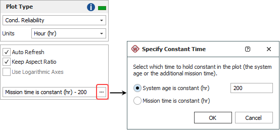
Conditional Reliability/Unreliability is available only when you are using the Repairable data sheet. These plots show the reliability/unreliability versus system age or mission time.
-
If you choose to hold the system age constant, the plots will show the reliability/unreliability for different mission times. For example, assuming that the system has already operated for 100 hours, the plot can show the reliability for the next 10 hours, 20 hours, 30 hours, etc.
-
If you choose to hold mission time constant, the plots will show the reliability/unreliability for different system ages. For example, assuming that the mission will be 100 hours, the plot can show the reliability for a system that has already operated for 10 hours, 20 hours, 30 hours, etc.
To specify which value will be held constant, click the [...] button on the control panel. In the window that appears, select the type of metric that will be held constant, as shown next. Then enter the constant value in the input field.
-
Tip: Weibull++ includes two additional plot utilities you can use across all types of data: the overlay plot, which allows you to compare different data sets or models; and the side-by-side plot, which allows you to display different plots of a single data set all in a single window for easy comparison.