Design Folio Plots
The Analysis Plot tab is added to a design folio the first time you choose Data > Analysis > Plot or click the icon on the Data tab control panel.
![]()
The options available on the Analysis Plot control panel vary depending on the selected plot. For general information on working with plots, see Plot Utilities.
The available plots will vary depending on the design type you are working with. The following plots may be available.
Level Plots (One Factor Designs Only)
Level plots allow you to visually evaluate the effects of different factor levels on the selected response.
The Comparison Chart shows the standardized difference for each paired comparison of factor levels. Use the Contrasts area of the control panel to select which pair of levels to show on the plot.
The Response vs. Level plot shows the observed output, or response, as well as the calculated mean output, at each level of the factor.
The Level Mean plot shows the mean output at each level of the factor. The center point of each level line is the calculated mean and the end points represent the high and low confidence bounds on the mean based on the alpha (risk) value specified on the Analysis Settings page of the control panel.
The Box Plot shows the output at each level of the factor. The top and bottom points at each level represent the highest and lowest responses. The points within the box represent the responses at the 25th, 50th and 75th percentile.
The Mean PDFs plot shows the pdf of the mean response at the selected factor levels.
The Life Characteristic plot (reliability DOE only) shows the calculated life characteristic at each factor level. The top and bottom tick marks on the vertical lines mark the two-sided confidence bounds on the life characteristic. The confidence level for the bounds is determined by the risk level specified on the Analysis Settings page of the Data tab control panel (e.g., if the risk level is 0.1, then 90% two-sided bounds would be shown).The value of the characteristic life depends on the selected distribution.
Eta is used for the Weibull distribution, and it is equal to the time at which unreliability = 63.2%.
Ln-Mean is used for the lognormal distribution, and it is equal to the time at which unreliability = 50%.
MTTF (i.e., the mean time to failure) is used for the exponential distribution.
Effect Plots
Effect plots allow you to visually evaluate the effects of factors and factorial interactions on the selected response.
The Pareto Chart - Regression plot shows the standardized effects of the selected terms (i.e., factor or combination of factors). The vertical blue line is the threshold value. If a bar is beyond the blue line, it will be red, indicating that the effect is significant.
The Pareto Chart - ANOVA* plot shows the inverse p value (1 - p) of each selected term. The vertical blue line is the threshold value. If a bar is beyond the blue line, it will be red, indicating that the term is significant.
The Pareto Chart - LRT (reliability DOE only) shows the inverse p value for the reduced model in the likelihood table. The vertical blue line is the threshold value. If the bar is beyond the blue line, it will be red, indicating that the factor has a significant effect on reliability.
The Effect Probability plot is a linear representation of probability versus the standardized effect (i.e., the probability that any term’s standardized effect will be lower than the given value). The points on this plot represent the values for each term in the T Value column of the Regression Table in the detailed analysis results. If there is no error in the design, then the probability versus the effect is shown and the points on this plot represent the values for each term in the Effect column of the Regression Table in the analysis results.
Select Normal in the Scale Type area to display the negative and positive values of the effects (coefficients). The negative effects will appear to the left of the probability line.
Select Half-normal to display the absolute values of all the effects, which allows you to compare the size of each effect. All the effects will appear to the right of the probability line.
The Main Effects plot shows the mean effect of the selected factor(s). The points are the observed Y values at the low and high level for each factor. The line connects the mean value at each factor level, and you can specify how the means are calculated in the Calculation Options area. Note that if you are using actual factor values in the plot, you can plot only one factor at a time. If you are using coded values, you can plot multiple factors simultaneously. For mixture designs, this plot applies only to process factors (i.e., process variables).
The Interactions plot shows the mean effect of a selected factor versus another selected factor at each level. If the green and red mean effect lines are parallel, there is no interaction between the two factors. You can specify how the means are calculated in the Calculation Options area. For mixture designs, this plot applies only to process factors (i.e., process variables).
The Interaction Matrix shows multiple Interactions plots. The plots shown depends on the factors you select. For example, if you select factors A and B, then two interactions plots will be shown: one showing A versus B and another showing B versus A.
The Term Effect Plot shows the fitted means for all combinations of all factor levels for each selected term. You can specify how the means are calculated in the Calculation Options area.
The Cube Plot shows the mean values of the selected response for the combinations of the low and high levels of three selected factors. You can specify how the means are calculated in the Calculation Options area. Note that you have the option of selecting "none" for the third factor, generating a square (2-dimensional) plot. Only two level factors can be included in the Cube plot, and at least two quantitative factors (each run at two levels) must be included in the model for the Cube plot to be available.
The Scatter Plot shows the observed values of the currently selected response plotted against the levels of the selected factor. A 3-dimensional version of this plot is available in the 3D plot folio.
The Contour Plot shows how varying two selected factors affects the predicted response values, which are represented as colors. See Contour Plots. A 3-dimensional version of this plot ("Surface Plot") is available in the 3D plot folio. For mixture designs, this plot applies only to process factors (i.e., process variables).
Note that for mixture designs, main effects cannot be shown in the Pareto Chart - Regression and Effect Probability plots. This is because the T value (or standardized effect) is based on a comparison with 0, which is not appropriate for the coefficients of main effects in mixture designs.
The following effect plots are available only for mixture designs and apply only to mixture factors (i.e., components):
The Simplex Design Plot is available only when there are at least three components in the experiment, and it shows the different blends that were included in the experiment.
The Response Trace Plot is used to see the effect of each component. By default, the center of the design is set as the reference point (which you can change by clicking Set Factor Levels on the control panel). As one component’s proportion moves away from the reference point, the relative ratios of other components are kept constant. The x-axis is the amount of change of each component, and the y-axis displays the corresponding response values when x is changed. Each component has its own curve on the plot.
The Mixture Contour Plot shows how varying the three selected components affects the predicted response values, which are represented as colors. See Contour Plots. This plot uses the same principles as the simplex design plot to represent different mixtures (e.g., the center of the plot represents a blend with all three components in equal proportions). A 3-dimensional version of this plot ("Mixture Surface Plot") is available in the 3D plot folio.
Residual Plots
Residuals are the differences between the observed response values and the response values predicted by the model at each combination of factor values. Residual plots help to determine the validity of the model for the currently selected response. When applicable, a residual plot allows the user to select the type of residual to be used:
Regular Residual is the difference between the observed Y and the predicted Y.
Standardized Residual is the regular residual divided by the constant standard deviation.
Studentized Residual is the regular residual divided by an estimate of its standard deviation.
External Studentized Residual is the regular residual divided by an estimate of its standard deviation, where the observation in question is omitted from the estimation.
The plots are described next.
The Residual Probability* plot is the normal probability plot of the residuals. If all points fall on the line, the model fits the data well (i.e., the residuals follow a normal distribution). Some scatter is to be expected, but noticeable patterns may indicate that a transformation should be used for further analysis. Two additional measures of how well the normal distribution fits the data are provided by default in the lower title of this plot. Smaller values for the Anderson-Darling test indicate a better fit. Smaller p values indicate a worse fit.
The Residual vs. Fitted* plot shows the residuals plotted against the fitted, or predicted, values of the selected response. If the points are randomly distributed around the "0" line in the plot, the model fits the data well. If a pattern or trend is apparent, it can mean either that the model does not provide a good fit or that Y is not normally distributed, in which case a transformation should be used for further analysis. Points outside the critical value lines, which are calculated based on the specified alpha (risk) value, may be outliers and should be examined to determine the cause of their variation.
The Residual vs. Order* plot shows the residuals plotted against the order of runs used in the design. If the points are randomly distributed in the plot, it means that the test sequence of the experiment has no effect. If a pattern or trend is apparent, this indicates that a time-related variable may be affecting the experiment and should be addressed by randomization and/or blocking. Points outside the critical value lines, which are calculated based on the specified alpha (risk) value, may be outliers and should be examined to determine the cause of their variation.
The Residual vs. Factor* plot shows the residuals plotted against values of the factor selected in the Residual Factor area. It is used to determine whether the residuals are equally distributed around the "0" value line and whether the spread and pattern of the points are the same at different levels. If the size of the residuals changes as a function of the factor’s settings (i.e., the plot displays a noticeable curvature), the model does not appropriately account for the contribution of the selected factor. Points outside the critical value lines, which are calculated based on the specified alpha (risk) value, may be outliers and should be examined to determine the cause of their variation.
The Residual Histogram* is used to demonstrate whether the residual is normally distributed by dividing the residuals into equally spaced groups and plotting the frequency of the groups. The Residual Histogram Settings area allows you to:
Select Custom Bins to specify the number of groups, or bins, into which the residuals will be divided. Otherwise, the software will automatically select a default number of bins based on the number of observations.
Select Superimpose pdf to display the probability density function line on top of the bins.
The Residual Autocorrelation* plot shows a measure of the correlation between the residual values for the series of runs (sorted by run order) and one or more lagged versions of the series of runs. The default number of lags is the number of observations, n, divided by 4. If you select Custom Lags in the Auto-Correlation Options area, you can specify up to n -1 lags. The correlation is calculated as follows:
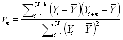
where:
k is the lag.
 is the mean value of the original series
of runs.
is the mean value of the original series
of runs.
For example, lag 1 shows the autocorrelation of the residuals when run 1 is compared with run 2, run 2 is compared with run 3 and so on. Lag 3 shows the autocorrelation of the residuals when run 1 is compared with run 4, run 2 is compared with run 5 and so on. Any lag that is displayed in red is considered to be significant; in other words, there is a correlation within the data set at that lag. This could be caused by a factor that is not included in the model or design, and may warrant further investigation.
The Fitted vs. Actual plot shows the fitted, or predicted, values of the currently selected response plotted against the observed values of the response. If the model fits the data well, the points will cluster around the line.
Diagnostic Plots
The Leverage vs. Order plot shows leverage plotted against the order of runs used in the design. Leverage is a measure (between 0 and 1) of how much a given run influences the predicted values of the model, where 1 indicates that the actual response value of the run is exactly equal to the predicted value (i.e. the predicted value is completely dependent upon the observed value). Points that differ greatly from the rest of the runs are considered outliers and may distort the analysis.
The Cook’s Distance* plot can show Cook’s distance (i.e., a measure of how much the output is predicted to change if each run is deleted from the analysis) plotted against either the run order or the standard order for the currently selected response. Points that differ greatly from the rest of the runs are considered outliers and may distort the analysis.
The Box-Cox Transformation* plot can help determine, for the currently selected response and model, what transformation, if any, should be applied. The plot shows the sum of squares of the residuals plotted against lambda. The value of lambda at the minimum point of this curve is considered the "best value" of lambda, and indicates the appropriate transformation, which is also noted by default in the lower title of the plot.
* These plots are available only when there is error in the design, indicated by a positive value for sum of squares for Residual in the ANOVA table of the analysis results.