Custom Charts
In the spreadsheet module for ReliaSoft Workbooks, you can use the Document > Chart commands to insert your own custom charts. The charts can be placed anywhere in the spreadsheet, and are dynamic (automatically update when the data used to create the chart is changed).
Adding a Chart
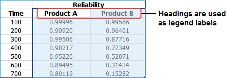
- Select the cells that contain the data of interest. In the example data below, the headings are included in the selection and will be used as the legend labels.
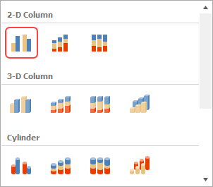
- Choose Document > Charts. Choose the chart type, and then click a chart subtype that you want to use.
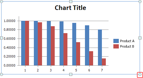
- To move the chart, click and drag the chart to the desired location.
- To resize the chart, click the chart and then drag the sizing handles to the desired size.
Changing the Data Displayed on an Axis
To change the way the data series is displayed on the axes, click the chart, then choose Design > Data > Switch Row/Column.
![]()
Changing the Chart Type and/or Data Set
You can change the type of chart and/or the data that is used in a chart at any time. To do this, click the chart and then:
- To change the chart type, choose Design > Type > Change Chart Type. Select the desired type.
![]()
- To change the data set, choose Design > Data > Select Data. Select the cells that contain the data of interest.
Applying a Chart Layout and/or Chart Style
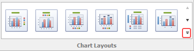
- To apply a predefined chart layout, choose Design > Chart Layouts. As an example, the following picture shows some of the options for 2-dimensional bar charts. To see the rest, click the arrow in the bottom-right corner.
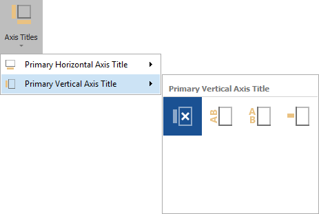
If none of the predefined options are suitable for your chart, choose Layout > Labels, then select the option you want to customize. The following picture shows the options for the vertical axis.
- To apply a predefined chart style, choose Design > Chart Styles.

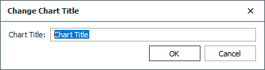
Renaming Chart and Axes Titles
When displaying chart and/or axes titles, you can rename the titles by right-clicking the chart and selecting the appropriate title option from the shortcut menu. For example, choosing Change Chart Title opens the following window:
Modifying the Axes and Gridlines
To hide or display axes and/or gridlines, choose Layout > Axes > Axes or Gridlines.
![]() or
or ![]()
- When displaying axes, you can change direction of the x-axis and/or change the scale of the y-axis.
- When displaying gridlines, you can increase or decrease the number of