FMEA Plots
You can create an ad hoc plot for an FMEA or RCM analysis by choosing Home > Reporting > Plots.
![]()
In the window that appears, select the item(s) you want to include in the plot. The selected item(s) must include at least one FMEA, functional failure analysis or risk discovery analysis; otherwise the plot will not display any data. Click OK to launch the Plot Viewer, which will display the plot and provide options for editing the plot.
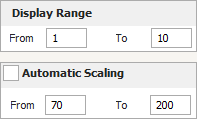
Note that for all pareto charts, you can specify the range of the FMEA records to show on the plot by using the Display Range area on the Plot Viewer's control panel. The scaling of the dependent axis will be based on the minimum and maximum data values of the records in the specified range. If you wish to manually assign values for the scaling, clear the Automatic Scaling check box on the control panel and then enter the desired values in the From and To fields, as shown next.
To save an image of the plot, click the Export Plot Graphic icon on the Plot Viewer's control panel. Plot images can be saved in *.jpg, *.gif, *.png or *.wmf format.
Types of Plots
The following list describes all available plots that can be created for an FMEA analysis. For general information on working with plots, see Plot Utilities.
- RPN (Pareto) shows the Risk Priority Numbers (RPNs) of the causes ranked from highest to lowest. Click the RPN Type drop-down list on the control panel to choose which values to display. You can view the initial RPNs only, the revised RPNs only, or both values in combination. If you view both values, you can select to sort by either initial or revised values.
- RPN % Reduction Pareto shows the reduction in the RPNs of the causes, from the initial values to the revised values, ranked from the greatest percentage reduction to the lowest percentage reduction.
- Occurrence/Severity Matrix displays the severity ratings on the horizontal axis and occurrence ratings on the vertical axis and then plots each cause at the intersection of its severity and occurrence ratings. You can specify whether you want to view the initial or the revised ratings, and you can use the Priority Area Coordinates area of the control panel to specify the end points for the high and low priority lines.
Note: Pointing to a point on the generated occurrence/severity matrix will display information about the cause, including its severity and occurrence ratings. Note that if your analysis contains a very large number of cause descriptions, pointing to a symbol in the matrix may not display all of the causes represented by that point. However, all causes are still displayed in the Plot Summary.
- SxO Pareto, Effect Severity Pareto, Cause Occurrence Pareto and Cause Detection Pareto show the applicable values ranked from highest to lowest. Click the drop-down list on the control panel to chose which values to display. You can view the initial values only, the revised values only, or both values in combination. If you view both values, you can select to sort by either initial or revised values.
- Effect Severity Pie, Cause Occurrence Pie and Cause Detection Pie show the percentage of the effects or causes in the selected analysis that are represented by the rating value displayed in the plot legend. You can view the initial values or the revised values by clicking the drop-down list on the control panel.
- Classification Pie shows the percentage of the causes in the selected analysis that are represented by each special design manufacturing characteristic displayed in the plot legend.
- Action Status Pie shows the percentage of the actions in the selected analysis that are represented by each status type displayed in the plot legend. To exclude actions with a specific description, such as "None," you can select the Exclude Records with Description check box, then enter the specific values in the field.
- Control Type Pie shows the percentage of the controls in the selected analysis that are represented by each control type displayed in the plot legend.
- RD Questions Pie shows the percentage of the selected items that have a "Yes" answer to each risk discovery question displayed in the plot legend.
- RD Ratings Pareto shows the risk discovery rating values of the items ranked from highest to lowest.
- Effect FEC Pie is available only in RCM++ and shows the percentage of the effects in the selected analysis that are represented by each failure effect categorization type displayed in the plot legend.
Copy Information from the Plot
You can copy the plot data to the Clipboard so that you can paste it into another application by clicking the Copy Plot Data icon in the plot's control panel.
![]()
You can copy the plot summary information to the Clipboard so that you can paste it into another application by clicking the Copy Plot Summary icon in the plot's control panel.
![]()