Expected Failure Times Plot
The Expected Failure Times plot provides a visual depiction of what failure times you can expect to observe when you implement a particular test plan. If you perform the test and enter the actual failures as they’re observed, you can use the plot to monitor whether the test is proceeding as planned, which could provide an early warning that adjustments may be needed. The ReliaWiki resource portal has more information on the Expected Failure Times Plot at: http://www.reliawiki.com/index.php/Reliability Test Design.
Tip: You can also use this plot to determine whether a specified reliability demonstration test will exceed the allowable number of failures. For example, if you have designed a zero-failure test and wish to determine whether zero failures will occur during the test, you could examine the lower confidence bound of the first predicted failure for that test. This information will help you determine whether a failure is likely to occur before the end of the test.
Generating an Expected Failure Times Plot
Follow the steps outlined below to generate an Expected Failure Times plot.
- Enter the sample size, two-sided confidence level and
acceleration factor in the Plot
Setup area of the control panel.
The acceleration factor is obtained by dividing the product’s life at the use stress level by its life at the accelerated stress level to be used in the test, if applicable. For example, if the product has a life of 100 hours at the use stress level and it is being tested at an accelerated stress level that reduces its life to 50 hours, then the acceleration factor is 2. If you are testing units under normal operating conditions, then the acceleration factor is 1.
- Define the expected life distribution for your product, and then choose the time units to be used in the calculations. To enter the parameters, click the arrow in the Expected Failure Model area.
- A window will appear where you can select a life distribution and enter its parameters. If the estimated values of the distribution parameters are not available, you can use the Quick Parameter Estimator (QPE) to solve for them.
![]()
- In the same window, select the time units (e.g., hours) that will be used in the test. Then click OK to close the window and generate the plot.
Note: You can also get the parameters and time units from a calculated data sheet in the current project by clicking the Get Failure Model icon on the control panel. After you select the data sheet, click the Redraw Plot icon to generate the plot.
- The plot will show the predicted failures times for each test unit with a margin of error corresponding to the confidence level you entered in the Plot Setup area. The three vertical tick marks on each line display the lower confidence bound, median value and upper confidence bound for the expected failure time of a tested unit.

- To display actual failure times as points that can be compared against the estimated intervals, click the arrow in the Actual Failures box. A table will appear where you can enter the recorded failure times, as shown next. The entered times will be automatically sorted from least to greatest.
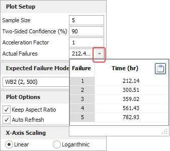
Tip: If you have a column of data copied to the Clipboard (e.g., from a data sheet), you can click the Clipboard icon at the top of the Time column to paste the data into the table.
You can view a calculated value by pointing to the relevant vertical tick mark on the plot. Alternatively, click Results (...) in the Expected Failure Time area of the control panel to view all calculated values at once.
Additional Control Panel Options
The control panel also includes the following options:
- Plot Options
area:
- Keep Aspect Ratio maintains the ratio of the horizontal size of the plot graphic to the vertical size when you resize the plot.
- Automatically Refresh will automatically update the plot whenever any of the inputs change. If this option is cleared, you will have to click the Redraw Plot icon to update the plot.
- X-Axis Scaling area, select the Linear check box to use a linear scale for time. Select the Logarithmic check box to use a logarithmic scale.
- Scaling area, the X and Y boxes show the minimum and maximum values for the x- and y-axes. To change these values, clear the check box beside the value range. If it is selected, the application will automatically choose appropriate values for the range.
- Plot Setup icon opens the Plot Setup window, which allows you to customize most aspects of the plot including the titles, line styles and point styles.
- RS Draw icon launches ReliaSoft Draw, which allows you to annotate your plot and view your plot in greater detail.
- Export Plot icon opens the Save As window, which allows you to save the current plot graphic in *.jpg, *.gif, *.png or *.wmf format.