Linearity and Bias Folio Plots
The following plots are available in the linearity and bias folio. They allow you to visually assess the accuracy of the measurement system. For general information on working with plots, see Plot Utilities.
- The Process Variation bar chart is available only when you specify the process standard deviation on the Settings page of the Data tab control panel. This chart shows the percentage of the observed process variation (i.e., total variation in the parts plus variation due to linearity/bias) that is due to linearity and the percentage due to bias.
- The Bias vs. Part plot shows the individual and average bias values sorted by the measured parts. Individual bias values (i.e., the differences between the reference values and particular measurements) are plotted as blue points, and average values (i.e., the differences between the reference values and the observed averages) are plotted as red squares. A blue dotted Zero Value Line marks the point at which there is no bias. You can use this plot to examine how the bias of the system (and the variation of the observed values) varies depending on the part.
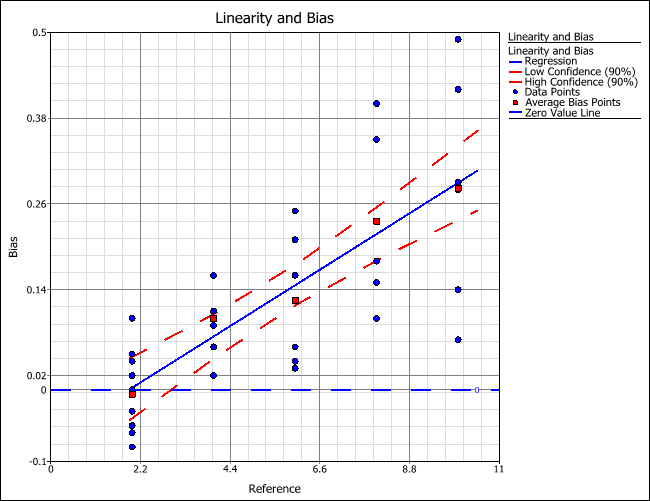
- The Linearity and Bias plot shows the individual and average bias values versus the reference values. The blue dotted Zero Value Line marks the point at which there is no bias. In addition, a regression line is fitted to the average bias points, showing the relationship between bias and reference (i.e., linearity). Confidence bounds are also drawn on the fitted line. The confidence level of the bounds is based on the risk level entered on the Settings page of the Data tab control panel (e.g., if the risk level is 0.1, then 90% two-sided upper and lower bounds are drawn on the line).
For example, the following plot shows that, as the reference value increases, the bias increases (i.e., there is linearity in the gage). In addition, you can see that when the reference value is 2, there is almost no bias (i.e., the average bias is almost zero).