Central Composite Designs: Example
The data set used in this example is available in the example database installed with the software (called "Weibull21_DOE_Examples.rsgz21"). To access this database file, choose File > Help, click Open Examples Folder, then browse for the file in the Weibull sub-folder.
The name of the example project is "Response Surface Method - Central Composite Design."
A chemical engineer is interested in determining the operating conditions that maximize the yield of a process.
A central composite design with five center points and alpha = 1.414 is used to conduct the experiment. A full quadratic model is fitted to the data.
Designing the Experiment
The engineer creates a central composite design folio, performs the experiment according to the design, and then enters the response values into the folio for further analysis. The design matrix and the response data are given in the "Central Composite Design" folio. The following steps describe how to create this folio on your own.
- Choose Home > Insert > Standard Design to add a standard design folio to the current project.
![]()
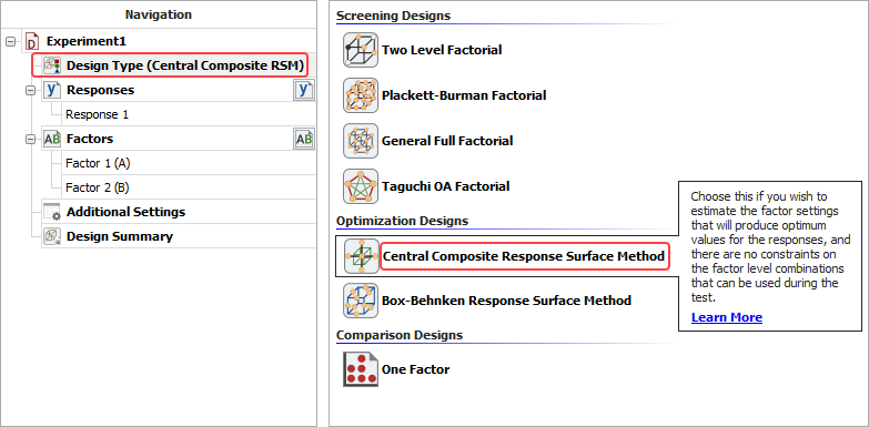
- Click Design Type in the folio's navigation panel, and then select Central Composite Response Surface Method in the input panel.
- Rename the folio by clicking the Experiment1 heading in the navigation panel and entering Central Composite Design for the Name in the input panel.
- Rename the response by clicking Response 1 in the navigation panel and entering Yield in the input panel.
- Specify the number of factors by clicking the Factors heading in the navigation panel and choosing 2 from the Number of Factors drop-down list in the input panel.
-
Define each factor by clicking it in the navigation panel and editing its properties in the input panel.
-
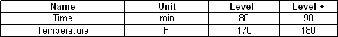
First factor:
- Name: Time
- Units: min
- Factor Type: Quantitative
- Level 1 (Low): 80
- Level 2 (High): 90
-
Second factor:
- Name: Temperature
- Units: F
- Factor Type: Quantitative
- Level 1 (Low): 170
- Level 2 (High): 180
-
First factor:
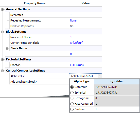
- Click the Additional Settings heading. In the input panel, set the following properties:
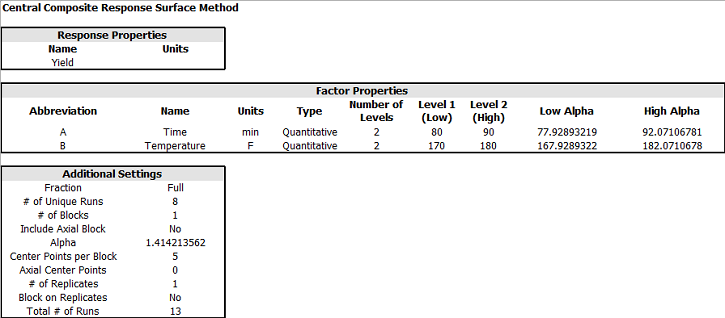
- Click the Design Summary heading to make sure that you have entered all settings correctly. The complete Design Summary is shown next.
- Finally, click the Build icon on the control panel to create a Data tab that allows you to view the test plan and enter response data.
![]()
Analysis and Results
The data set for this example is given in the "Central Composite Design" folio of the example project. After you enter the data from the folio, you can specify the settings for the analysis by doing the following:
Note: To minimize the effect of unknown nuisance factors, the run order is randomly generated when you create the design. Therefore, if you followed these steps to create your own folio, the order of runs on the Data tab may be different from that of the folio in the example file. This can lead to different results. To ensure that you get the very same results described next, show the Standard Order column in your folio, then click a cell in that column and choose Sheet > Sheet Actions > Sort > Sort Ascending. This will make the order of runs in your folio the same as that of the example file. Then copy the response data from the example file and paste it into the Data tab of your folio.
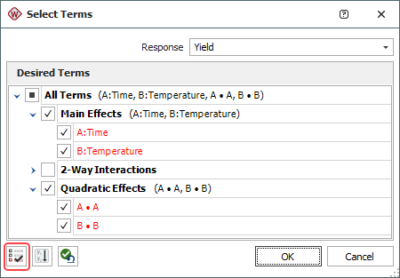
- Make sure all main effects and interactions will be considered. To do this, click the Select Terms icon on the control panel.
![]()
In the window that appears, select the All Terms check box then click OK.
- On the Analysis Settings page of the Control Panel, select to use Individual Terms in the analysis.
- Click the Calculate icon.
![]()
- The results in the Analysis Summary area on the main effects A and B, as well as the quadratic effects AA and BB, are significant.
- To view a plot comparing the standardized effect of each term, click the Plot icon.
![]()
Then choose Pareto Charts - Regression from the Plot Type drop-down list. The following plot appears.
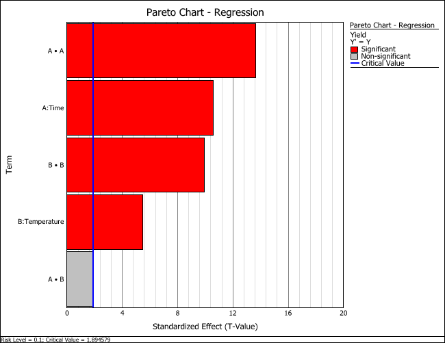
The vertical blue line in the plot marks the critical value determined by the risk level specified on the Analysis Settings page of the control panel. If the bar goes past the blue line, then the effect is considered significant.
From these results, effects A, B and AA and BB will be included in the reduced model. In fact, you could also include term AB in the model. From the Pareto chart, you can see that AB is only slightly below the critical value. The inclusion or exclusion of AB is a personal decision that should be made based on the knowledge of the experiment and the statistical results. For this example, only A, B, AA and BB will be included in the model.
Optimization
The results for the reduced model (which only includes the terms that were found to be significant) are given in the "Reduced Model" folio. The following steps describe how to create this folio on your own.
- Right-click the "Central Composite Design" folio in the current project explorer. Then choose Duplicate from the shortcut menu.
- Right-click the new, duplicated folio in the current project explorer and choose Rename from the shortcut menu. Change the name to "Reduced Model."
- Open the "Reduced Model" folio. Then click the Select Terms icon on the control panel.
- In the Select Terms window that appears, click the Select Significant Effects icon to select only the significant effects to calculate the new model, as shown next, then click OK.
- Click the Calculate icon.
- In the Analysis Summary area on the control panel, click the View Analysis Summary icon to view detailed results from the analysis.
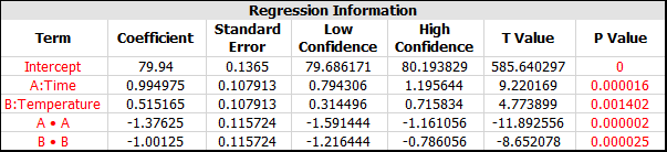
- In the Analysis Summary window, select the Regression Table check box on the Available Report Items panel. The coefficients for the model will appear in the Regression Table as shown next.
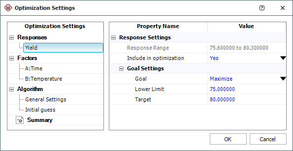
- Click the Design - Optimization icon on the control panel.
![]()
- In the Response Settings window that appears, use the settings shown next and click OK. These settings indicate that you want to maximize the Yield response, with values above 80 being considered 100% desirable and values below 75 being undesirable.
- An Optimization folio will appear with a plot showing the single solution that is found.
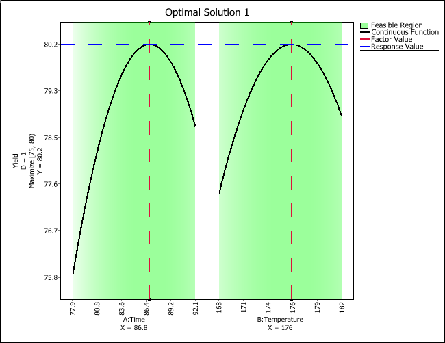
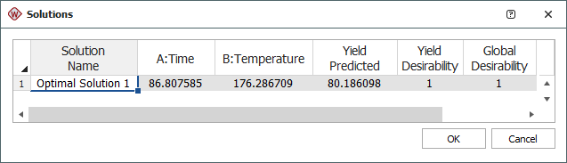
- You can choose Optimization > Solutions > View Solutions or click the icon on the control panel to see the solution in numerical format.
![]()
The optimum settings for factors A and B are shown next.
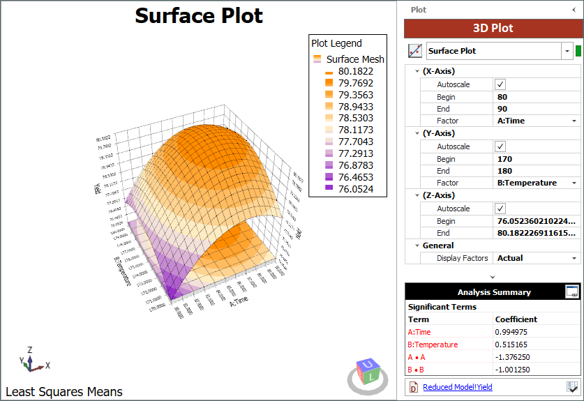
- You also can use the surface plot to visually identify the optimal settings for factors A and B. Return to the Analysis Plot tab of the "Reduced Model" folio and click the 3D Plot icon in the control panel.
![]()
The 3D Plot folio will open and display the surface plot, as shown next.
Conclusions
From the surface plot, you can see that the maximum yield occurs at Time = 86.8 and Temperature = 176.3° F, which is the same as the result from the optimization. The predicted maximum yield is 80.1861. Keep in mind that it is necessary to conduct an experiment using these settings to confirm this conclusion.