QCP Calculations and Plots for Multi-Phase Data
For reliability growth data analysis only.
Weibull++ includes a Quick Calculation Pad (QCP) for computing useful metrics, as well as multiple plots that allow you to visualize the results of your analyses. This topic describes the calculations and plots you can obtain from multi-phase data sheets analyzed with the Crow Extended – Continuous Evaluation model.
QCP Calculations
You can open the Quick Calculation Pad (QCP) by choosing Growth Data > Analysis > Quick Calculation Pad or by clicking the icon on the control panel.
![]()
To perform a calculation, select the appropriate option and enter any required inputs in the Input area, then click Calculate. For more detailed information about all the options available in the QCP, see Quick Calculation Pad (QCP).
The Basic Calculations tab of the QCP includes the typical calculations for traditional reliability growth analysis (e.g., cumulative/instantaneous MTBF and expected number of failures). These calculations are applicable only when your data set includes failure modes that were fixed before the end of the last test phase. (See QCP Calculations and Plots for Traditional RGA.)
On the Multi-Phase Calculations tab, the available calculations will vary depending on whether you’re analyzing failure times or mixed (discrete) data. For failure times, the calculated values will be mean time between failures (MTBF) and failure intensity (FI). For mixed data, the values will be reliability and probability of failure. Most of these calculations are applicable only when your data set includes BD failure modes. The projected and growth potential calculations apply only when the data set includes BD modes that will be fixed after the end of the last test phase (as specified in the Effectiveness Factors window).
The Demonstrated values reflect the reliability at the end of the last test phase, before any delayed fixes are implemented.
The Nominal values represent the best case scenario in which a fix is applied to every BD failure mode, even if the fix has not yet been implemented or planned. These calculations consider the implemented fix times (I events) and all of the effectiveness factors (even if the fix is marked "Not Implemented").
Nominal Projected are the expected values after the delayed fixes for all seen BD failure modes.
Nominal Growth Potential are the best possible values that could be achieved if all delayed fixes are implemented for all seen and unseen BD failure modes.
The Actual values take into account which delayed fixes have actually been implemented in the current management strategy. These calculations consider the implemented fix times (I events) and the effectiveness factors for the fixes that were marked to be implemented after a specific test phase. However, any BD failure mode that is marked as "Not Implemented" in the Effectiveness Factors window is given an EF=0.
Actual Projected are the expected values after the delayed fixes that are actually implemented for seen BD failure modes.
Actual Growth Potential are the best possible values that could be attainable by applying the current management strategy for both seen and unseen BD failure modes.
Discovery Rate is the rate at which new BD failure modes are being discovered (i.e., the failure intensity of unseen BD modes) at a specified time. For example, if the discovery rate at 400 hours is 0.02, then 0.02 new BD modes are being discovered every hour (equivalently, 2 new BD modes are discovered every 100 hours).
MTBF BD Unseen is the mean time between failures due to unseen failure modes at a specified time (i.e., BD modes that did not appear during the observation period but are estimated from the analysis).
Number of Failures is the cumulative number of failures that are expected to occur by a specified time, based on the fitted model.
If the data set includes some failure modes that were fixed before the end of the last test phase, then this value is calculated on the assumption that the reliability changed during the test. The option will thus be on the Basic Calculations tab with the other typical calculations for traditional reliability growth analysis (e.g., cumulative/instantaneous MTBF).
Otherwise, the calculation assumes that the reliability neither deteriorated nor improved during the observation period (i.e., beta = 1).
Plots
You can create plots by choosing Growth Data > Analysis > Plot or by clicking the icon on the control panel.
![]()
This section describes the types of plots you can create for the Crow Extended – Continuous Evaluation model. The scaling, setup, exporting and confidence bounds settings are similar to the options available for all other reliability growth analysis plot sheets. (See Plots.)
Once again, the available calculations will vary depending on whether you’re analyzing failure times or mixed (discrete) data. For failure times, the calculated values will be mean time between failures (MTBF) and failure intensity (FI). For mixed data, the values will be reliability and probability of failure.
Also note that all projected and growth potential values displayed in the plots are based on the "actual" (not "nominal") calculations.
Cumulative Number of Failures shows the total number of failures versus time. Data points on the plot represent the cumulative number of failures that have been reported by a given time (e.g., the second point marks the time at which the second failure was observed). The lines that can be included will vary depending on whether there the data set includes failures modes that will be fixed before the end of the last test phase.
If some failure modes will be fixed before the end of the last test phase, the plot can include the Expected Failures line, which serves as an empirical goodness-of-fit test for the Crow Extended model. It is fitted using the beta that was calculated from the data points.
If no failure modes will be fixed before the end of the last test phase, the plot can include the Assumed Parameters line based on the assumption that beta = 1 (i.e., no reliability growth was experienced during the observation period) and the Estimated Parameters line based on the beta calculated from the data points. You can then compare the two lines to evaluate whether the beta = 1 assumption is valid.
The [Value] vs. Time plots show how the value increases, decreases or remains constant over time. The points represent the actual failure times in the data set and the plot includes one line for the instantaneous value and one line for the cumulative value. These plots are available when your data set includes failure modes that were fixed before the end of the last test phase.
The Growth Potential plots are applicable only when the data set includes failure modes that will be fixed after the end of the last test phase (as specified in the Effectiveness Factors window). The plots can include these items:
The Demonstrated/Achieved point represents the value at the end of the test, before any delayed fixes have been implemented.
The Projected point represents the expected value after the delayed fixes have been implemented.
The Growth Potential line represents the best value that could be achieved by applying the current reliability growth management strategy (i.e., the portion of the system's failure intensity that will be addressed by design fixes).
If desired, you can use the Show/Hide Plot Items window to show the Instantaneous line, which shows how the value changes over time during the test. The instantaneous value is calculated over a small interval dt that begins at a given time. For example, an instantaneous MTBF of 5 hours at 100 hours duration means that, over the next small interval dt that begins at 100 hours, the average MTBF will be 5 hours.
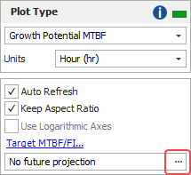
If desired, you can estimate the projected MTBF or failure intensity with a specified amount of further testing. This option is applicable only for developmental testing when BD failure modes are included in the data. To enable this option and specify a time greater than the termination time, click the [...] button.
The Final bar charts provide the same information as the Growth Potential plots, but using bars instead of lines.
Cumulative Number of BD Modes shows the total number of unique observed BD modes versus time. This plot can include these items:
Data points on the plot represent the cumulative number of BD modes that have been discovered by a given time. For example, the second point marks the time at which the second unique BD mode (e.g., BD2) was observed.
The Cumulative Number of BD Modes line is fitted to the data points and shows how the cumulative number of discovered BD modes changes with time.
MTBF BD Unseen and Discovery Rate show the rate at which new unique BD failure modes are being discovered at any given time. For example, if the MTBF for unseen BD modes is 50 hours, then 2 more unique BD modes are expected to be observed over the next 100 hours. The discovery rate is the failure intensity of the unseen BD modes (i.e., the inverse of the MTBF). In a successful reliability growth test, the MTBF for unseen BD modes will increase over time and the discovery rate will decrease.
The Individual Mode bar charts show two bars for each failure mode. Use the Plot Modes window to choose which failure modes to include in the chart.
The Before bars represents the value at the end of the test, before any delayed fixes have been implemented.
The After bars are available only for BD modes and represents the value after the delayed fixes have been implemented.
The Failure Mode Strategy pie chart breaks down the overall failure intensity (FI) into six possible categories:
The Type A slice represents the FI that is due to failure modes that are ignored (i.e., no fixes will be implemented).
The Type BC - Seen slice represents the FI that is due to BC modes that were observed and for which fixes were implemented.
The Type BC - Unseen and Type BD - Unseen slices represents the FI that is due to BC and BD modes that were not observed but are estimated from the analysis. If they were observed (e.g., through future testing), fixes would be implemented.
The Type BD - Remained and Type BD - Removed slices represent the FI that is due to BD modes that were observed (i.e., they represent the FI due to seen BD modes). The Remained slice represents the portion of FI that is expected to stay in the system because the fixes are not 100% effective, while the Removed slice represents the FI that is expected to be eliminated.
Tip: Weibull++ includes two additional plot utilities you can use across all types of data: the overlay plot, which allows you to compare different data sets or models; and the side-by-side plot, which allows you to display different plots of a single data set all in a single window for easy comparison.