Phase Diagram Results and Plots
The results available for phase diagrams, including those available in the Results Explorer and those available in the simulation QCP, are identical to the results available for simulation diagrams.
The plots available for phase diagrams are the same as the simulation diagram plots, with the exception that there are also system - phases plots available. In addition, for certain plots, you must specify which phase(s) you want to show in the plot.
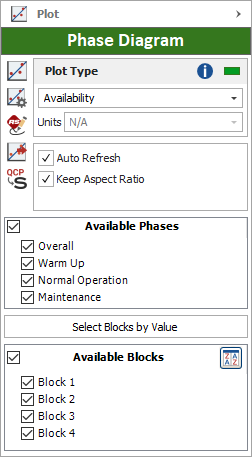
- Available Phases allows you to specify which phases to display on the plot. To select all phases, click the check box in the table header. To select individual phases, click the check box in each row.
The Available Phases option is available for all system - phases plots, metrics plots and blocks plots (other than the Block Backlog plot, which provides information about the backlog at the end of the simulation time, and the Block Bubble plot). It is also available for all crews plots and spare part pools plots if your analysis includes those items.
The system - phases plots display information about the individual phases that make up the phase diagram.
- Availability - All Events shows the percent of time that the system is available during the simulation (taking into account all system downing events) and the phase RS DECI (i.e., the number of system downing events in that phase divided by the total number of system downing events across all phases). Bar size indicates system availability during the phase; bar color indicates the RS DECI value of the phase, as shown in the legend. Point to a bar to view the system availability during that phase.
- Availability w/o PM, OC & Inspshows the percent of time that the system is available during the phase (taking into account all downing events, but not preventive, on condition or inspection tasks) and the system RS DECI (i.e., the number of system downing events in that phase divided by the total number of system downing events across all phases). Bar size indicates system availability during the phase; bar color indicates the RS DECI value of the phase, as shown in the legend. Point to a bar to view the system availability during that phase.
- Costs shows the system costs and the system availability during the simulation. Bar size indicates system costs during the phase; bar color indicates system availability during the phase, as shown in the legend. Point to a bar to view the system availability and costs accrued during that phase.
- Downtime shows the amount of time the system is down and the system availability during the simulation. Bar size indicates system downtime during the phase; bar color indicates system availability during the phase, as shown in the legend. Point to a bar to view the system availability and downtime during that phase.
- Expected Failures shows the expected number of failures for the system and the system availability during the simulation. Bar size indicates the expected number of failures during the phase; bar color indicates system availability during the phase, as shown in the legend. Point to a bar to view the system availability and expected number of failures during that phase.
- Expected Downing Events shows the expected number of downing events for the system and the system availability during the simulation. Bar size indicates the expected number of downing events during the phase; bar color indicates system availability during the phase, as shown in the legend. Point to a bar to view the system availability and expected number of downing events during that phase.
- Throughput shows the number of units processed/produced by the system and the system availability during the simulation. Bar size indicates system throughput during the phase; bar color indicates system availability during the phase, as shown in the legend. Point to a bar to view the system availability and throughput during that phase. If your simulation does not include throughput then no information will be displayed for this plot.